Client
Tools
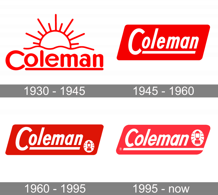
Though a timeless company and series of products, Coleman has been finding it challenging to reach younger audiences and set themselves apart in a market that is heavily saturated with gear from competitors. Where-as most similar companies have updated their branding, simplifying their designs, Coleman has maintained a complex and outdated design. Our challenge is to give a refresh and maintain a historical connection to a company with over 124 years of history.
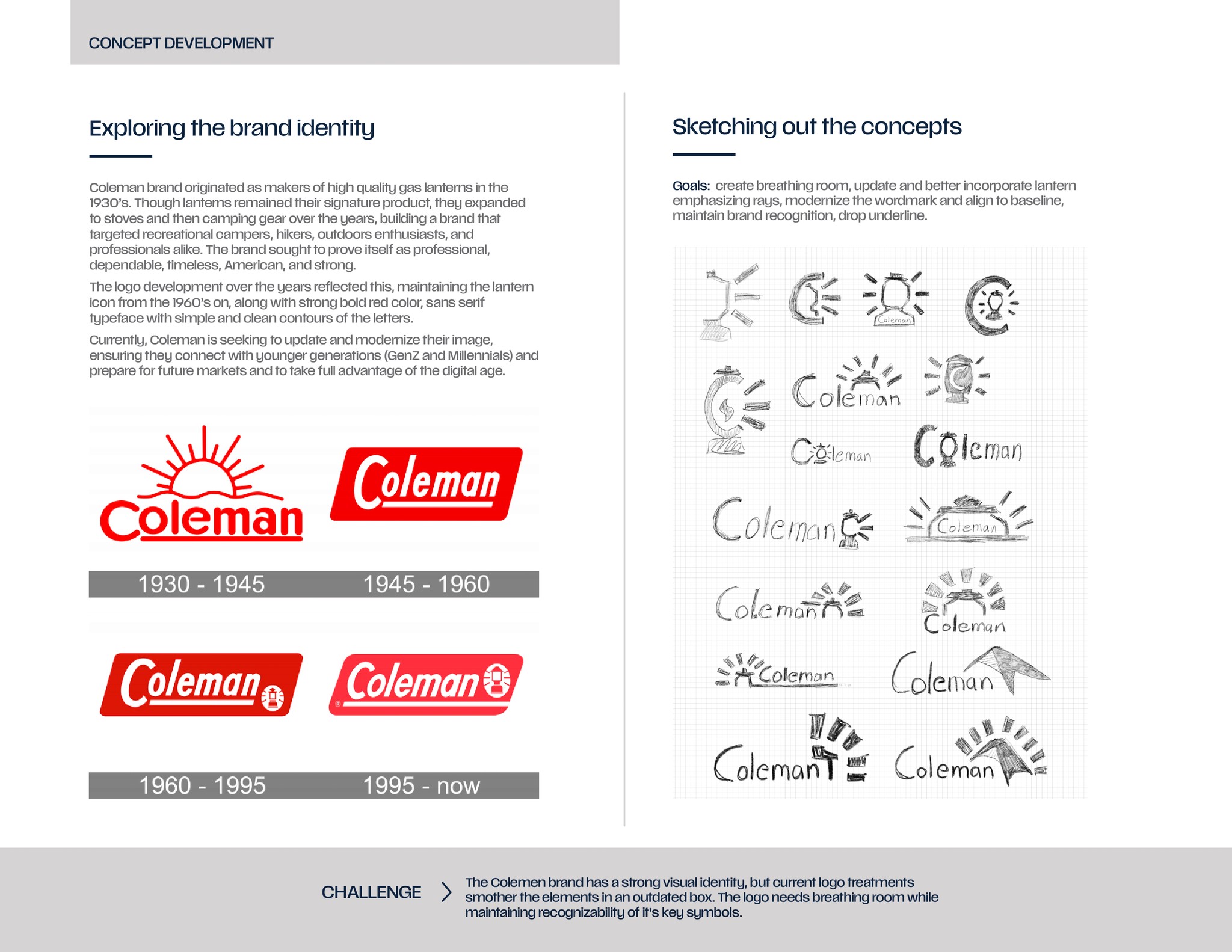
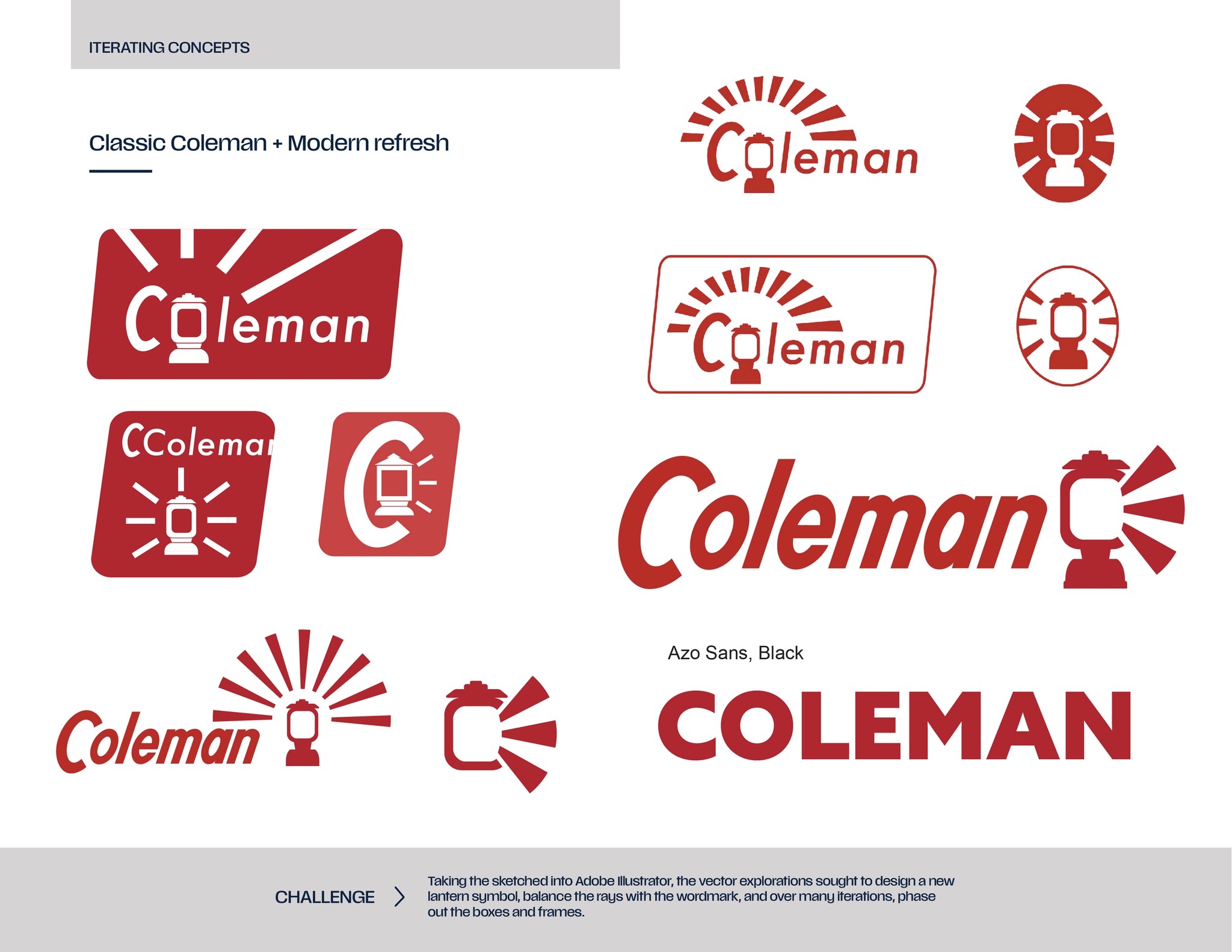
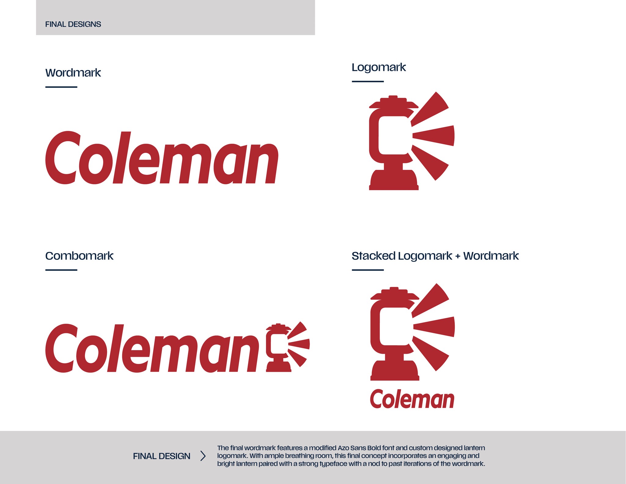
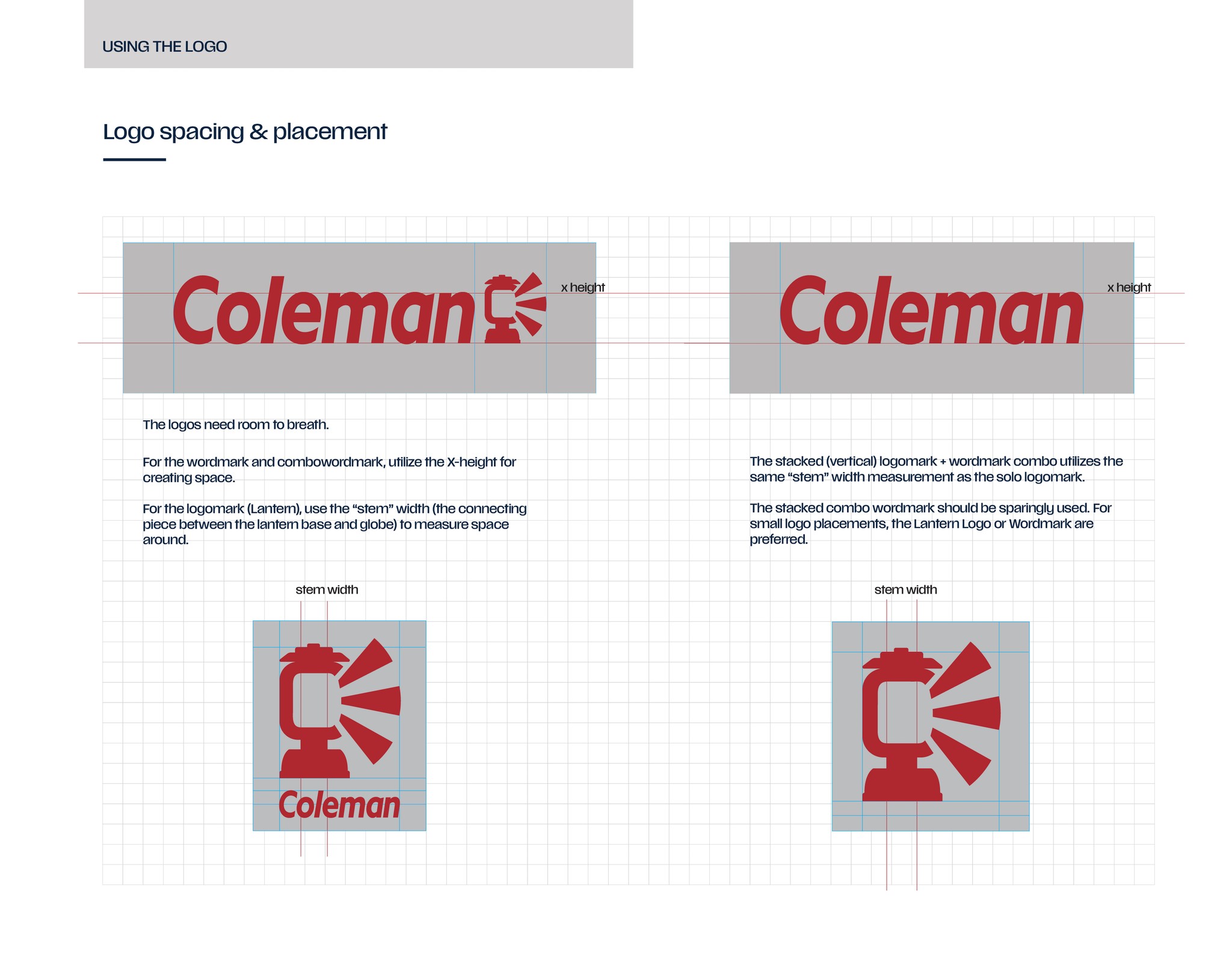
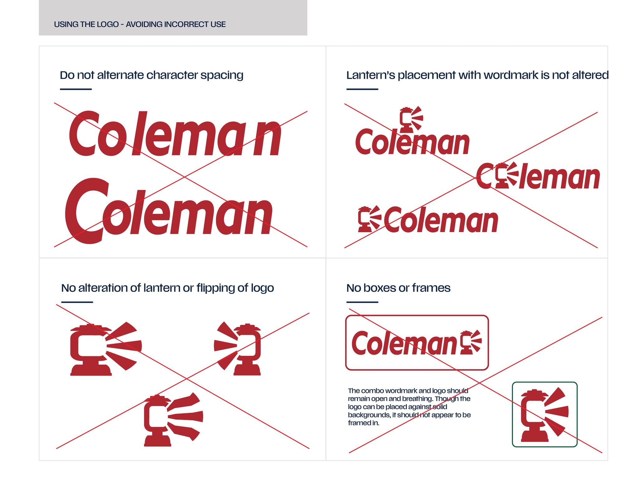
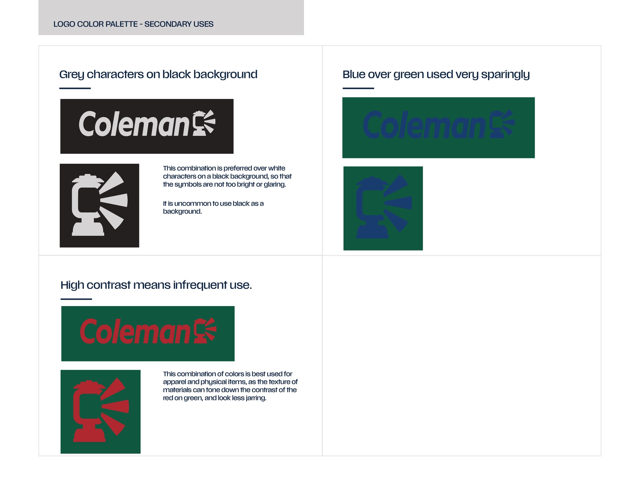
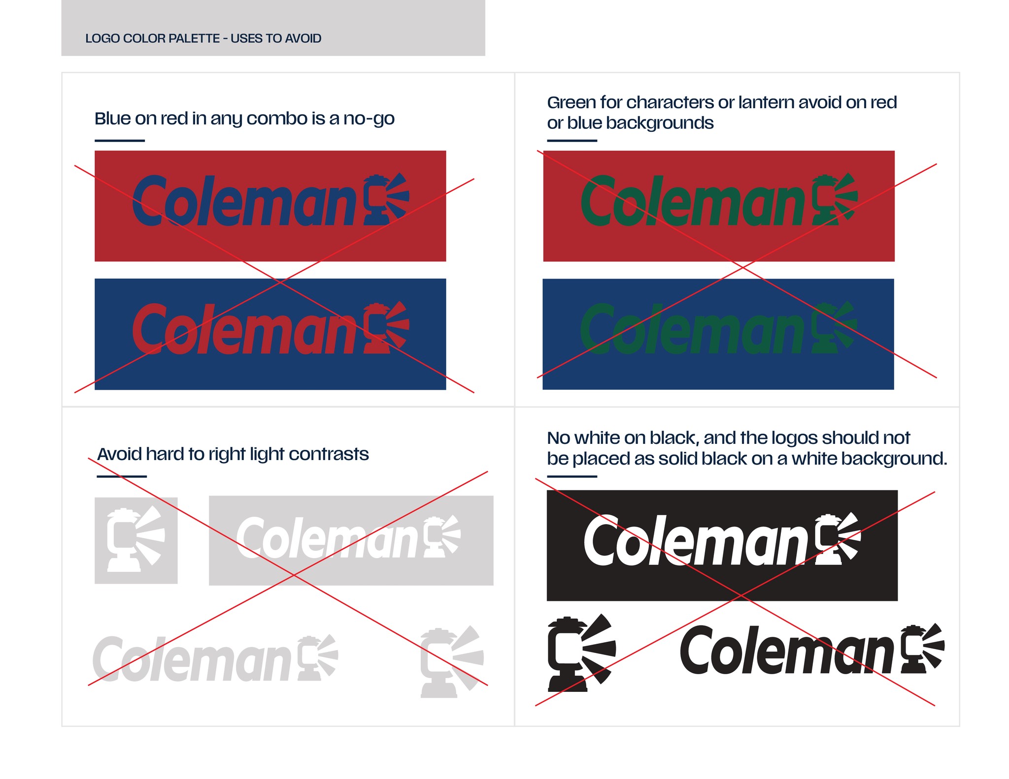
The journey to design a new wordmark, logomark, and combination are detailed in a brand guide presentation for Coleman.
Recognizable
Historical Connection
Light = Trust & Safety
Connection with original logo
Modified Anzo Sans Bold Italic
Characters & Logo aligned along base
Logo & Wordmark better connected
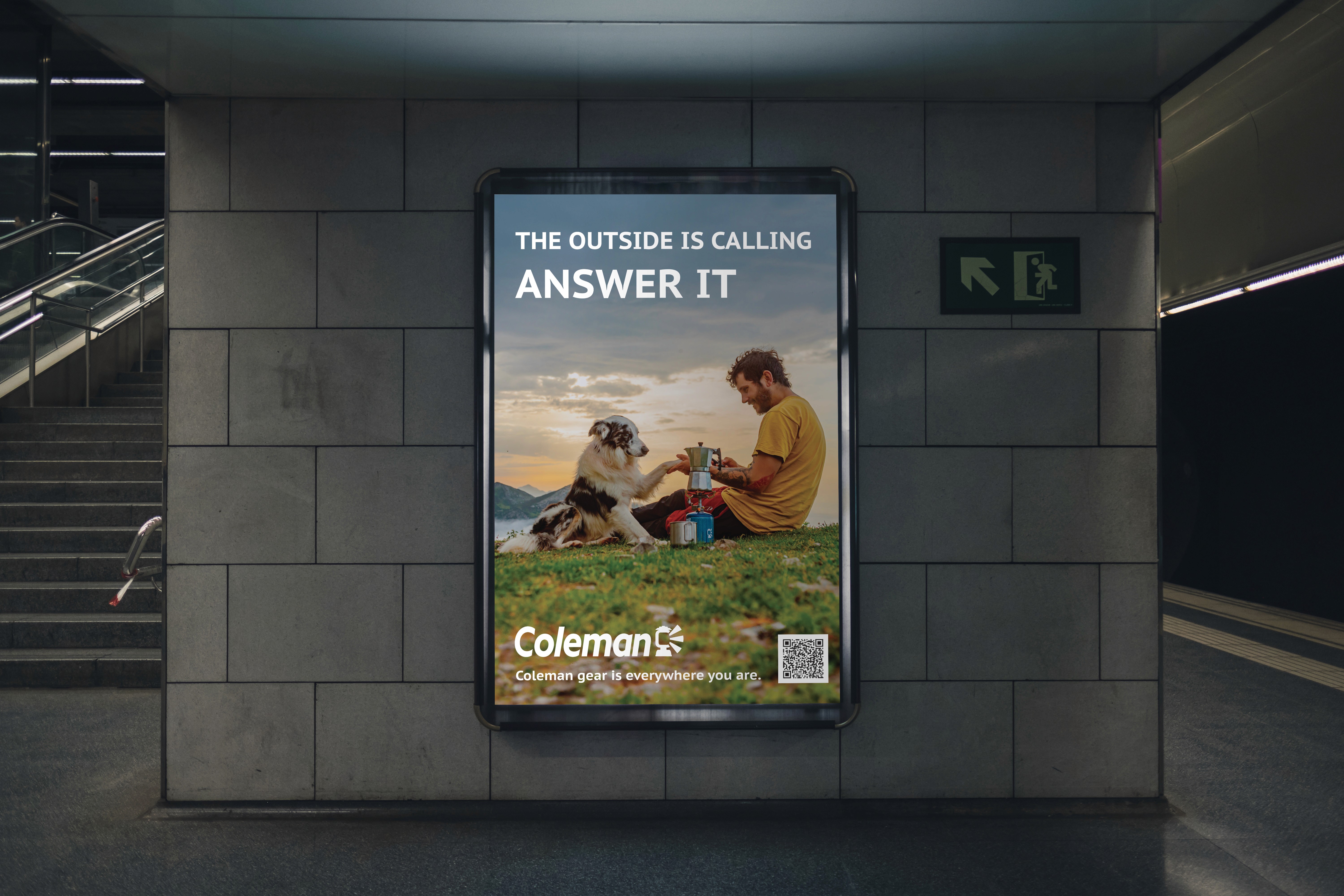
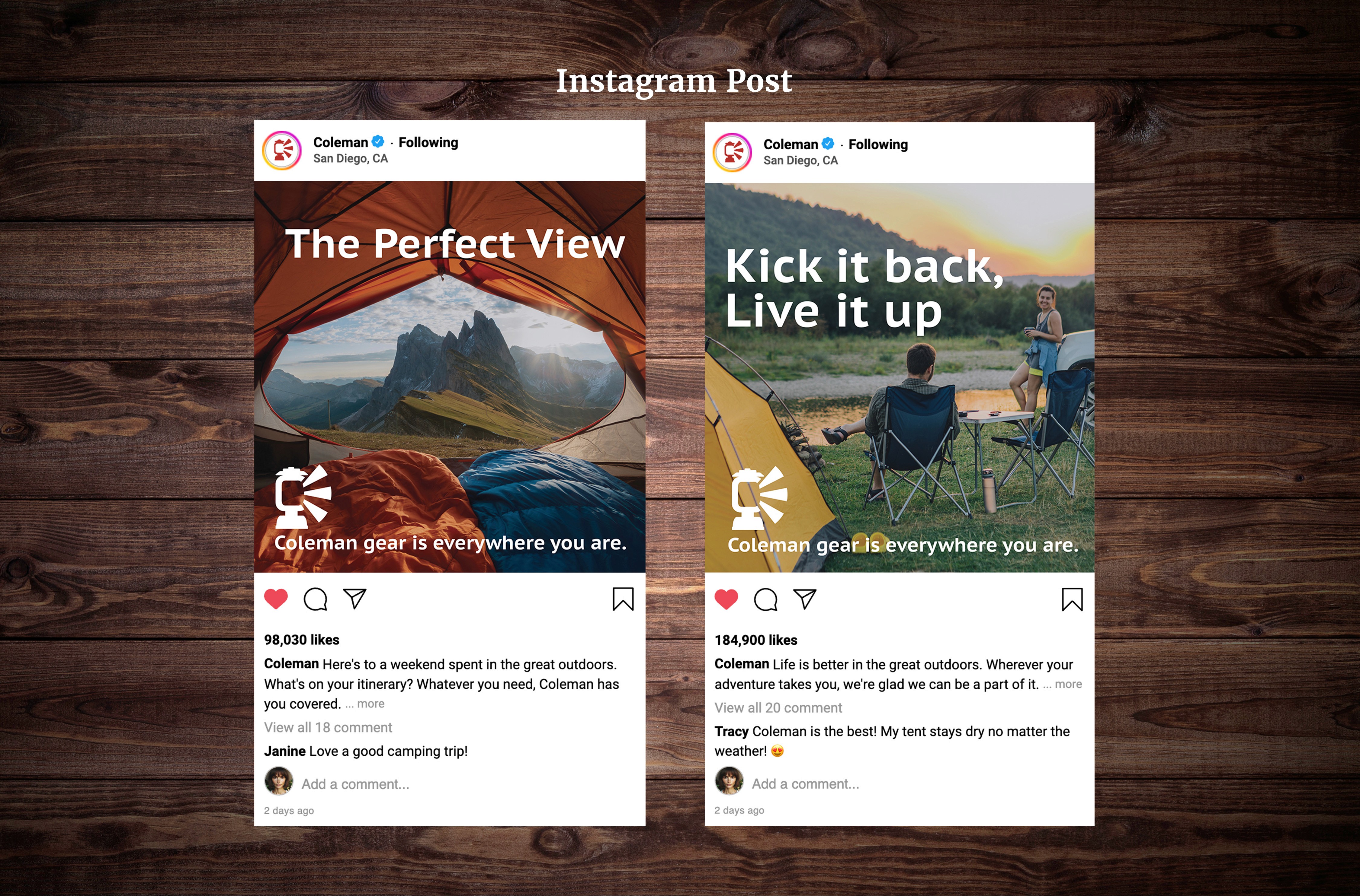
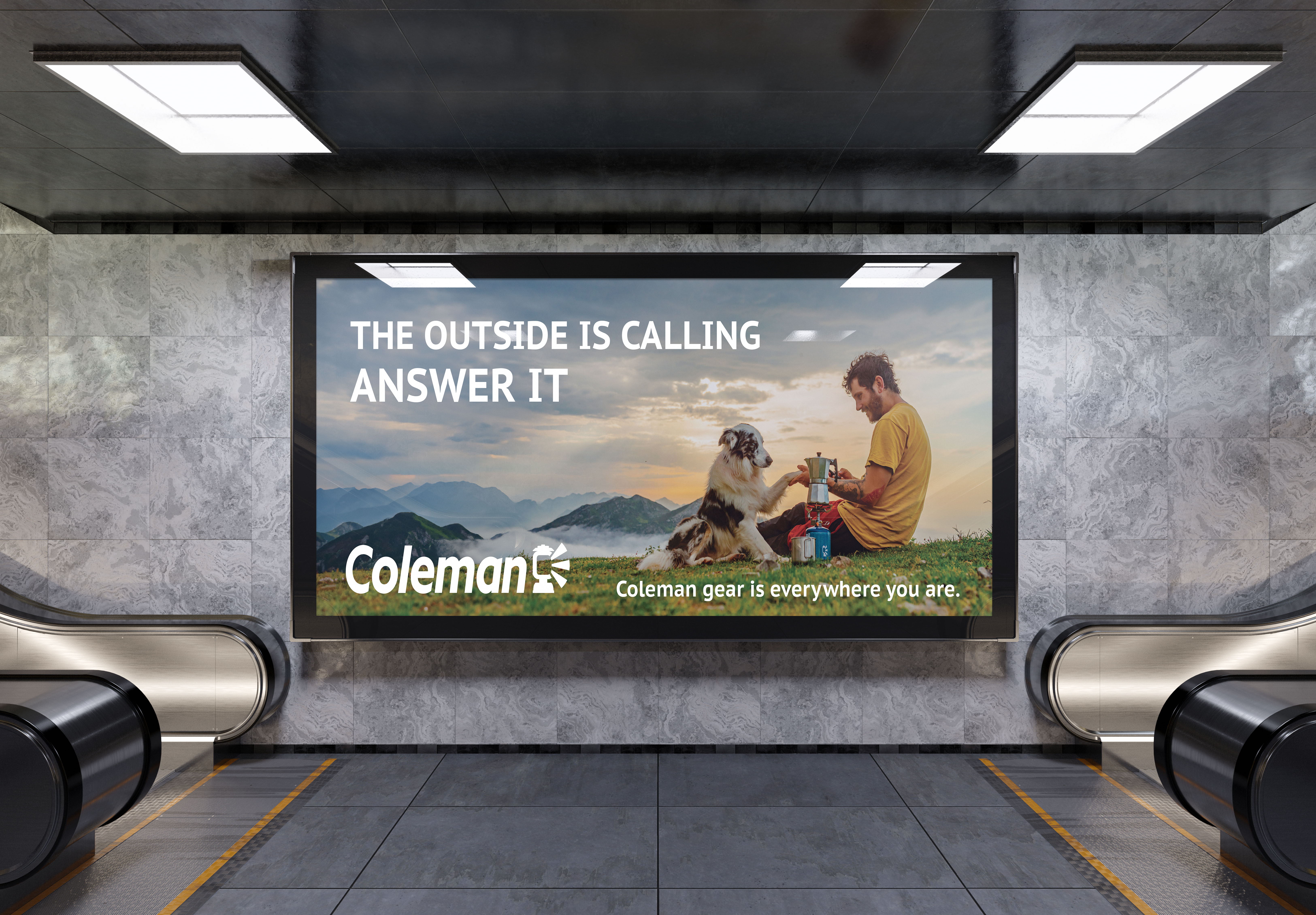
With a new logo and fresh perspective, Coleman is better able to advertise to a younger and broad audience. The logos are more versatile and uniform, lending themselves to a more cohesive brand identity.

