The Insider
Magazine Design System
Company
Sierra Club
My Role
Designer
Tools
InDesign Illustrator Photoshop
Timeline
2023-2024
Description
Transforming a basic email newsletter into a vibrant seasonal print publication.
Context
The Sierra Club is a grassroots environmental organization based in the United States, with many local chapters. Their goal is to amplify the power of millions of members and supporterss to help defend everyone's right to a healthy world. This concept design focused on building a comprehensive cover and spread system for their members newsletter, The Insider, elevating it from a bi-weekly email into a quarterly print publication.
Challenge
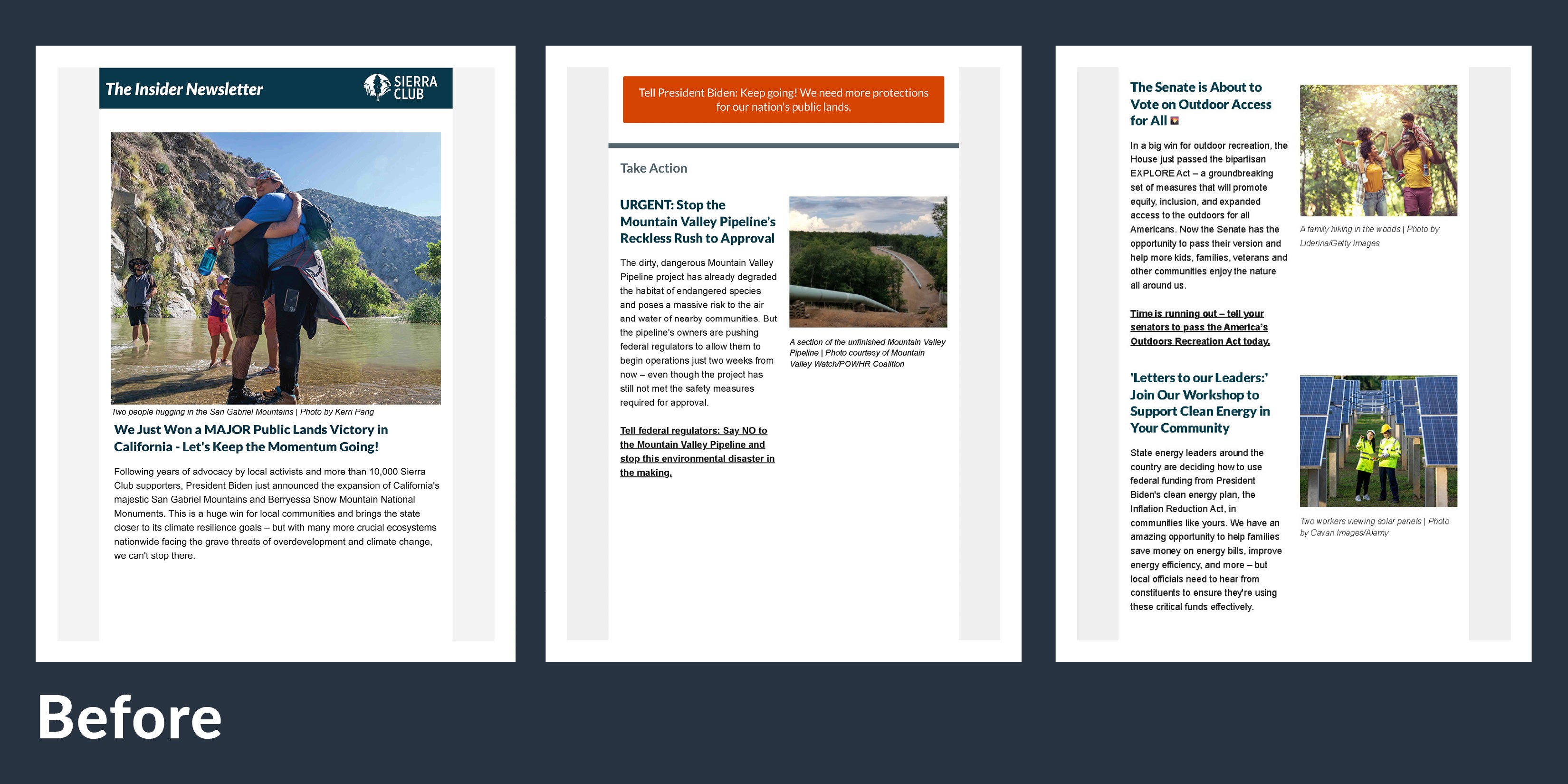
Currently, The Insider Newsletter is an HTML email sent out bi-weekly to club members. It's format is basic and focuses on traditional hierarchy. To elevate the publication, it needed a more dynamic and comprehensive design that grows from Sierra Club's brand identity and guidelines. The cover should entice the reader to take a journey through the various spreads, be informed, and excited Sierra Club's campaigns.

Process
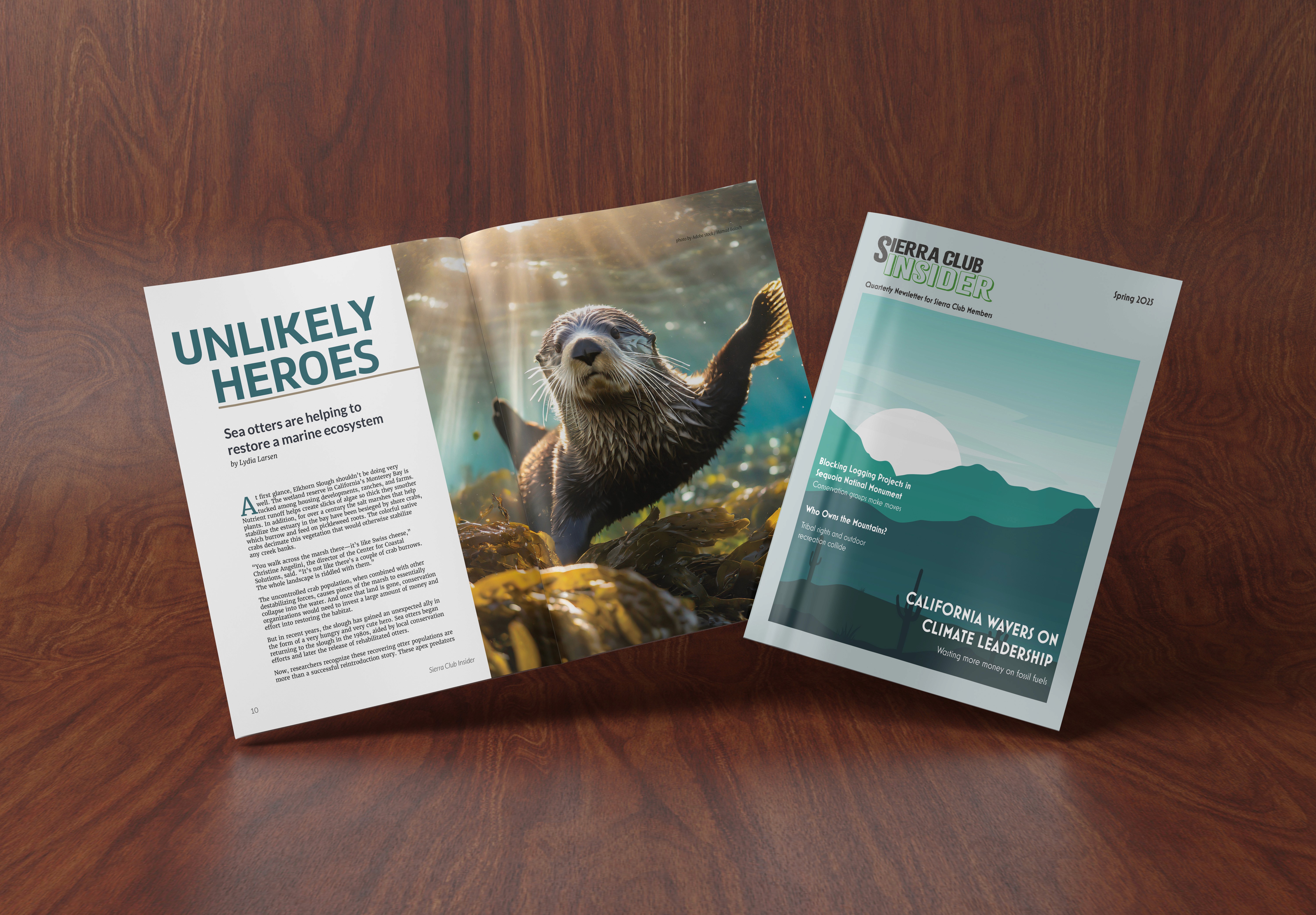
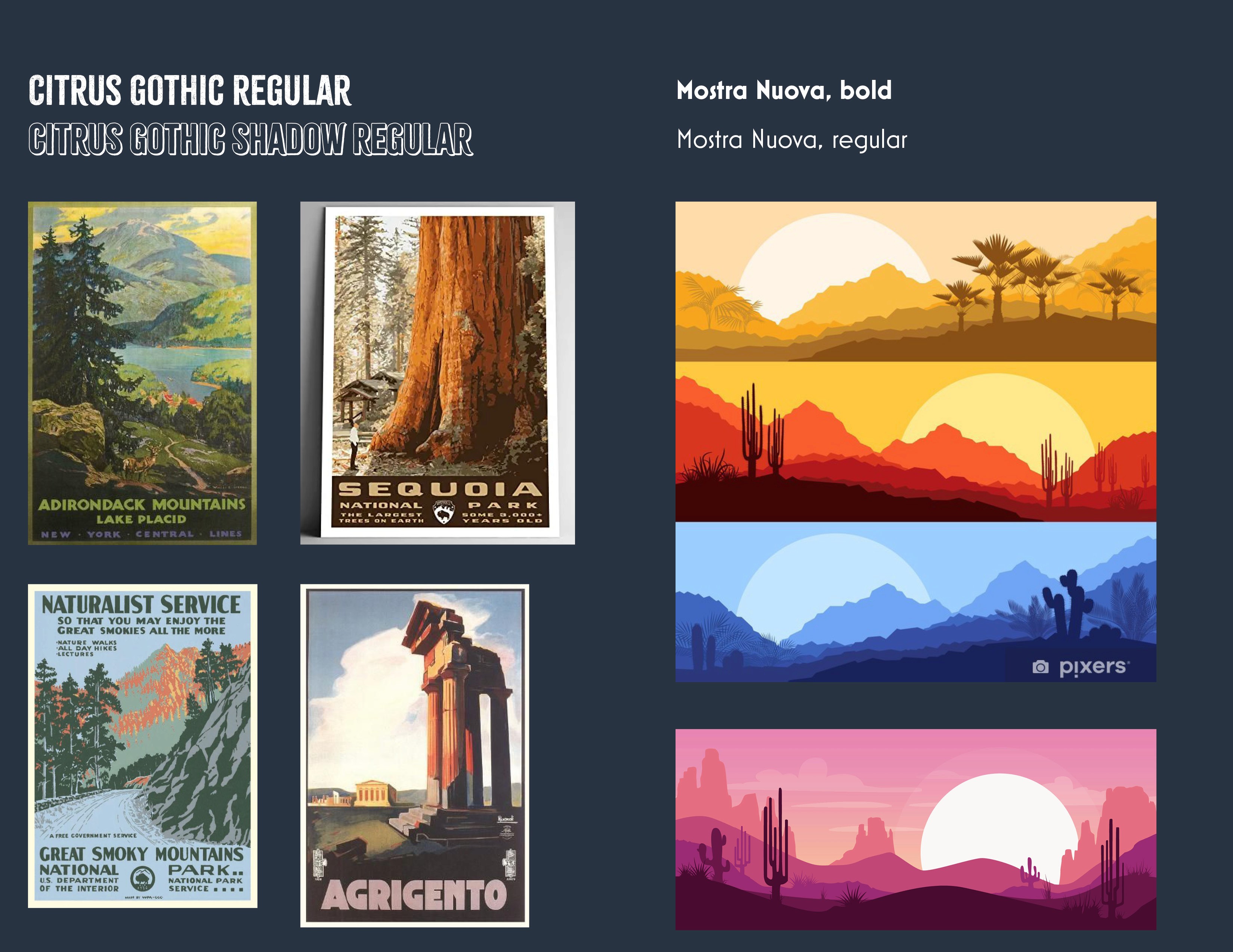
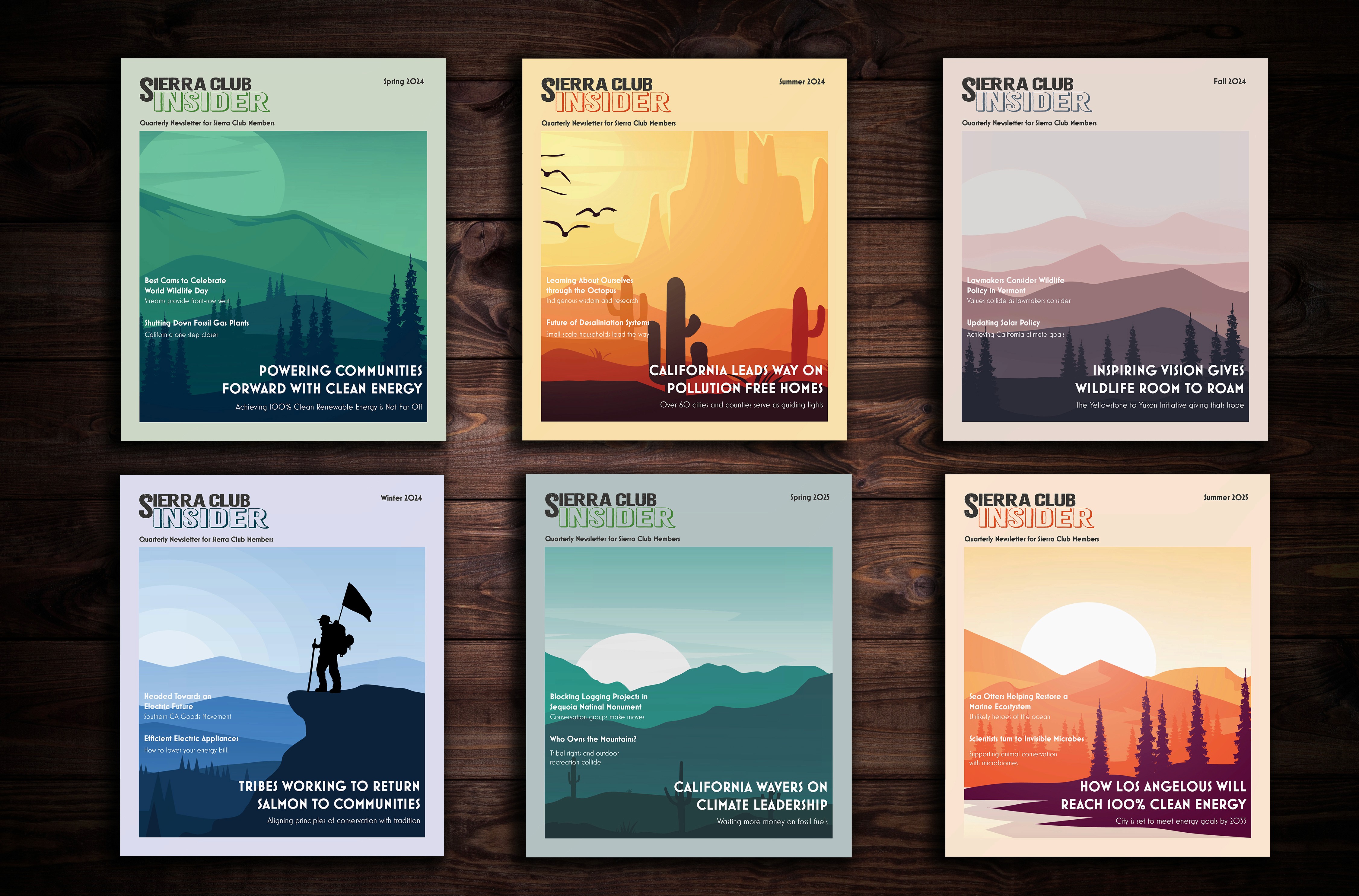
The design for the covers was inspired by mid-century travel posters and the beauty of natural landscape artwork. Our concept was further inspired by beautiful monochromatic vector artwork that featured landscape silhouettes. The Sun popped out as a vibrant and engaging feature. The typeface choices were guided by popular mid-century style forms.
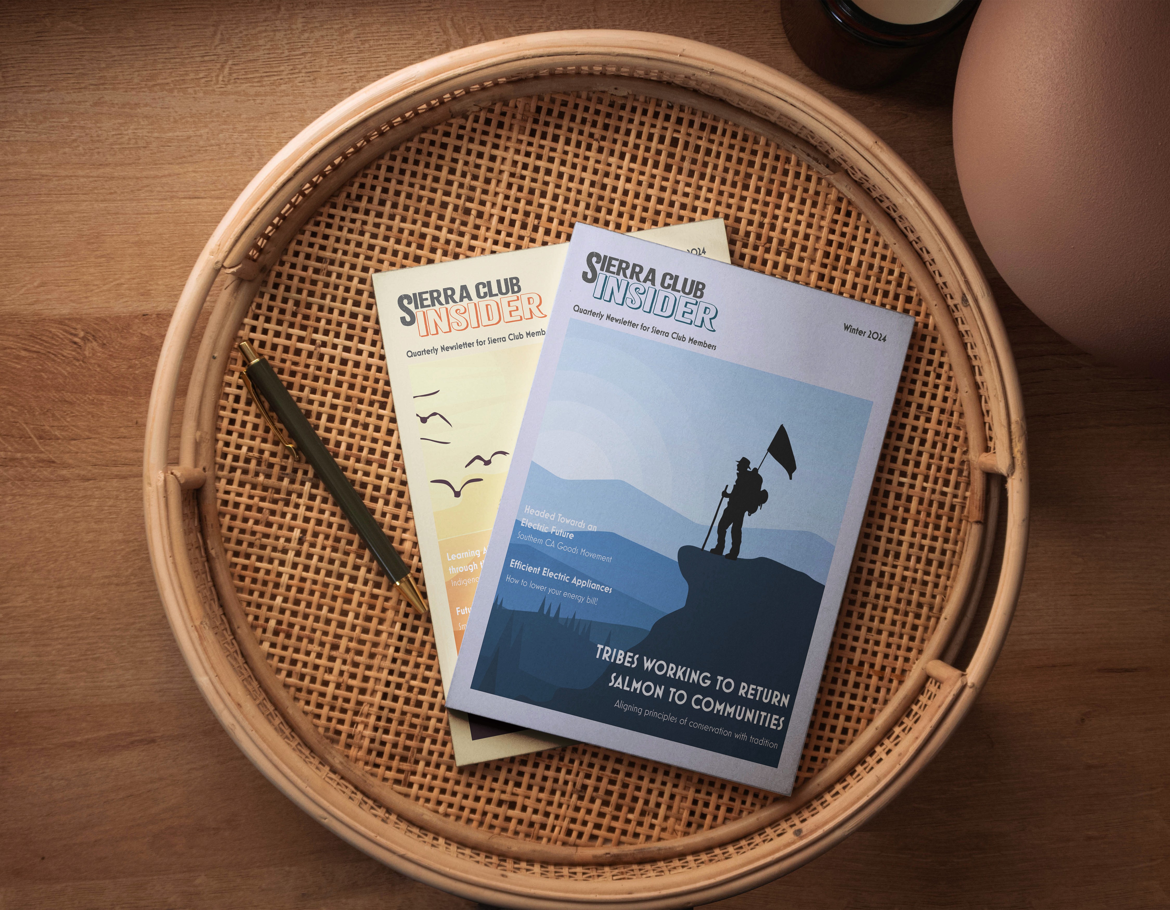
As a seasonal magazine, a system would need to be developed to guide future publications and create a cohesive brand:
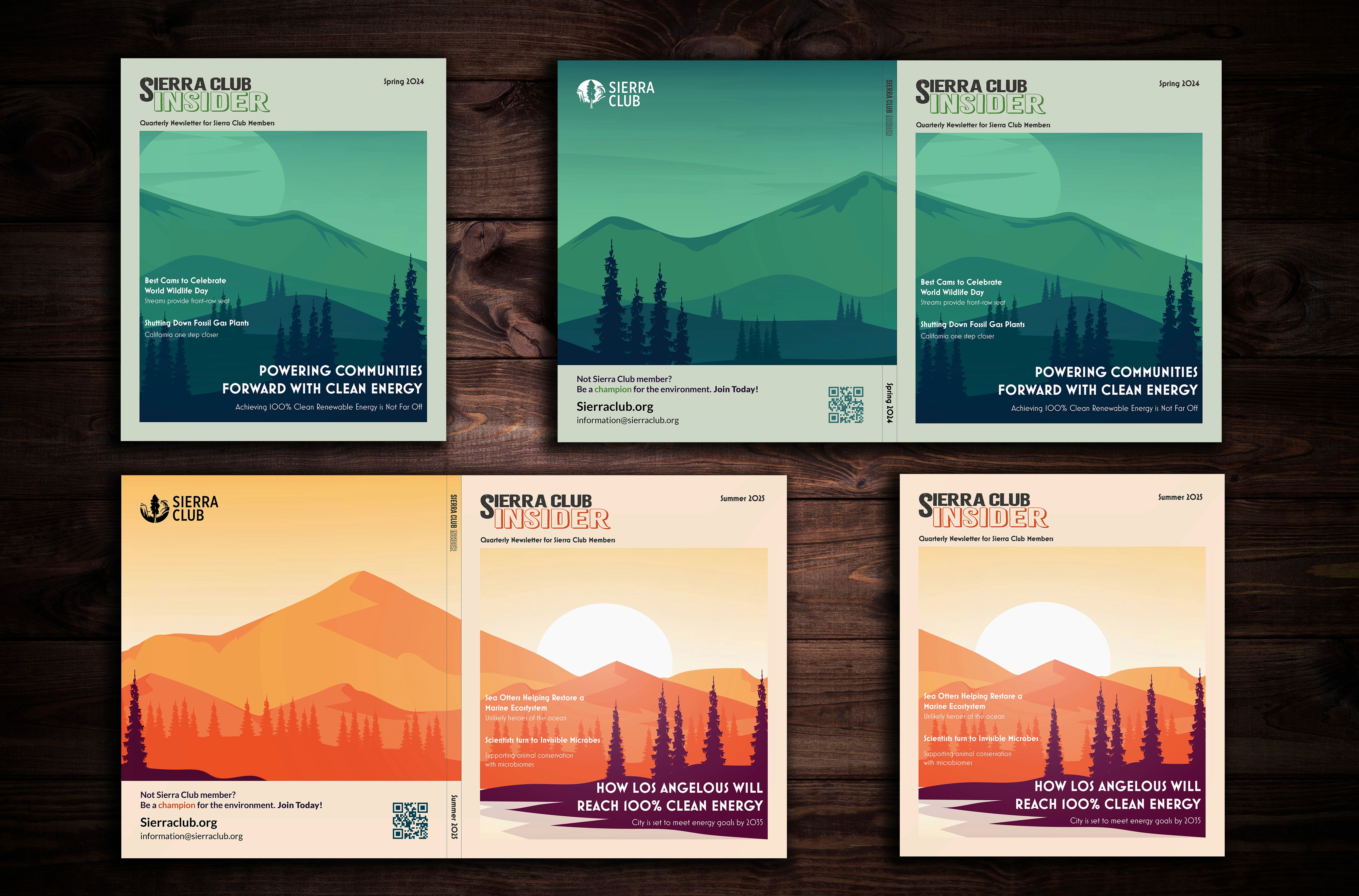
A 10 x 10 grid with .125 inch gutters, generated in InDesign was developed to
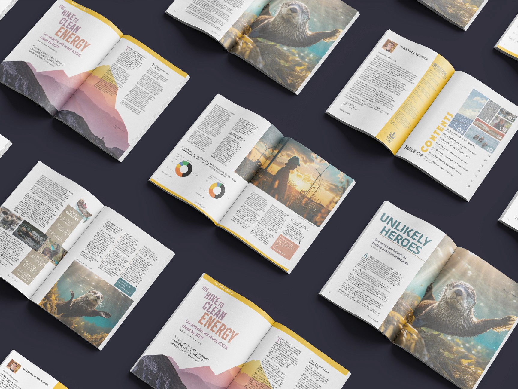
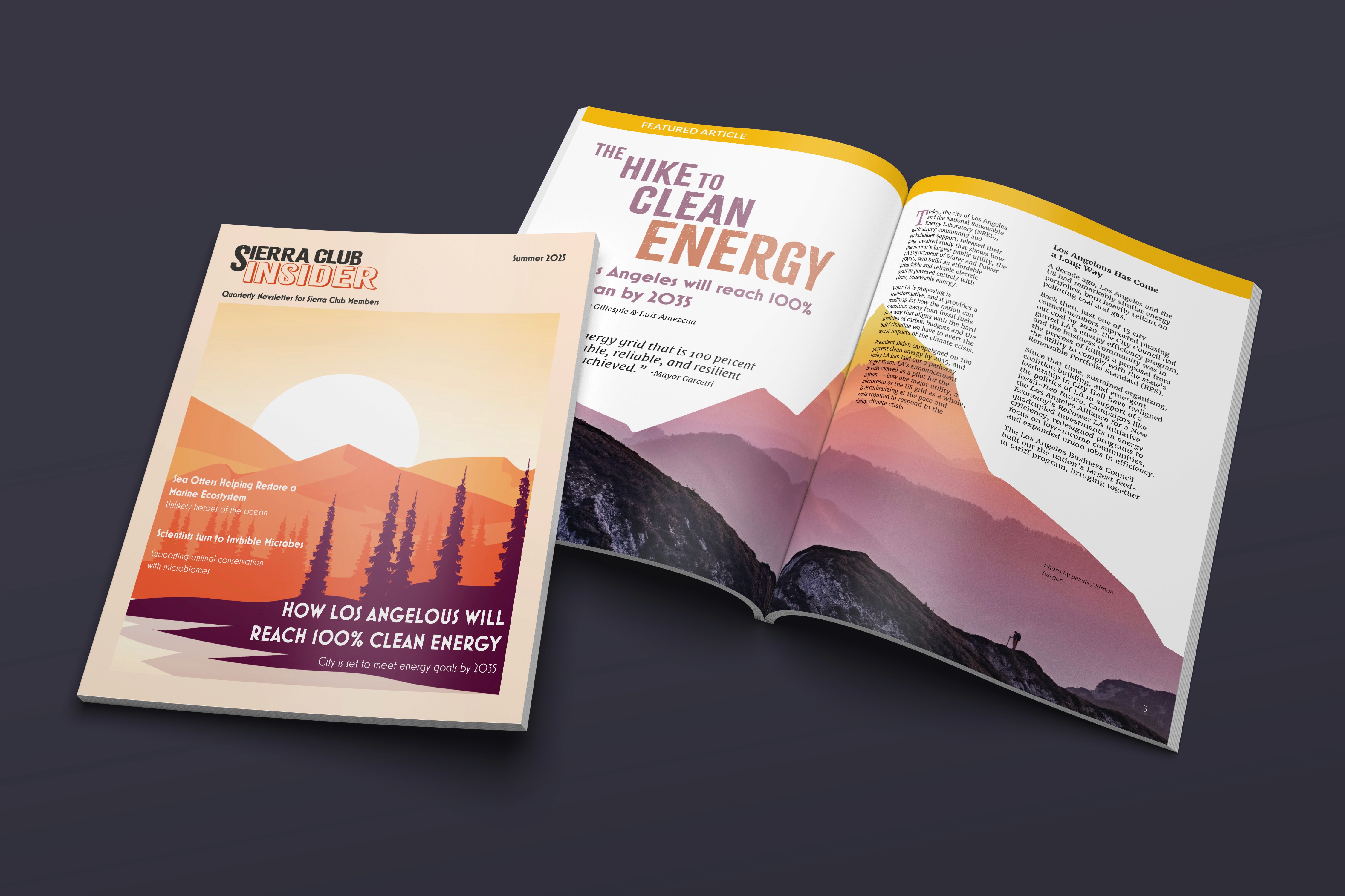
To support the mid-century travel style, Citrus Gothic Regular was adopted for the new Masthead (logo) and some sparing use for primary headers throughout the inner spreads.
For subtitles and smaller headings, Mostra Nuova, bold & regular were applied
The quarterly publication's color palettes and background imagery would support the primary seasons that they are published in: Spring, Summer, Fall, and Winter.
Solution
The final designs reflect Sierra Club members' love of the environment and the organization's coverage of important issues, campaigns, and events while engaging the reader with beautiful illustrations and photography. The need for beautiful photographs and cover art provides a perfect opportunity to employ local artists, further grounding the publication into the community.
Cover illustrations utilized vibrant silhouettes crafted from vector artwork, featuring natural features, animals, plants, and people of the California and American landscape. The artwork is the star, spanning from front cover to the back, giving opportunity for the reader to enjoy it's beauty and scope.
Key Insights
We turned a basic and boring HTML email campaign into an illustrative and compelling magazine. This was a concept design created for Sierra Club. With this redesign, we elevated the publication to a new level and created an artifact that if published to Sierra Club members, would be a collectable and treasured addition to their home libraries.